
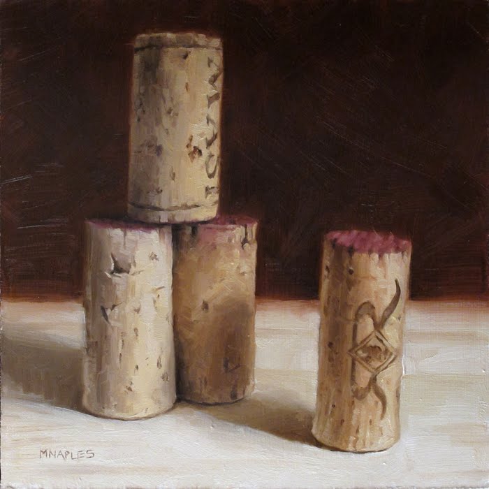
Oil on 1/4" Board. Approx 6"x6" SOLD
I especially love the cork in the front with the two R's on it. Love, love, love it. As I was painting this one, I kept thinking this was an ode to how imperfect corks are. I really enjoyed capturing the imperfections.
4 comments:
Oh, that's my sign - the double R, and those imperfections are naturalistic nice; I think of WABI and SABI...
I like the wine stain on the ends. I think the top cork with the rings at each end is the best-looking one.
You did a really nice job on the lettering as well as adding all those little marks and indentations in the corks.
-Dean
Very nice one too
Post a Comment